
Element Properties
Two contexts for the same layer kinds
This page describes generation-time overrides — properties you can change on an existing design's layers for one render. Creating a design's layer structure from scratch is a different operation — see Design Import → Layer Types. Full explanation: Layers overview.
10 components are currently available — each card opens its override reference:








| Component | Description |
|---|---|
| Text | Text layers with rich formatting, markups, fonts, and decorations |
| Button | Clickable button elements with labels and styles |
| Image | Image layers with cropping, fit, and overlay options |
| Logo | Logo layers with smart background removal |
| Shape | Geometric shapes and decorative elements |
| Rating | Star or custom-icon rating display |
| Illustration | Illustration elements from the Abyssale library |
| QR Code | Dynamically generated QR codes |
| Video | Video layers for animated formats |
| Audio | Audio layers for video formats |
Additionally, the background of every format can be customized via the root element.
Common properties
These properties are available for all components except root (the root element accepts only background_color):
| Property | Description |
|---|---|
hidden | Boolean: true, false. Hides the current element if true. Sending hidden: true also satisfies a mandatory layer without providing its content. |
Two rules that apply to every element
- Hex and
cmyk()/cmyka()work on every design type — CMYK is meant for print, and is converted to RGB onstatic/animated. Gradients are accepted only onroot/text/button/shapefill colors, and on aprinter/printer_multipagedesign only on a shape or buttonbackground_color— see Colors & Gradients. - Unknown properties are not rejected — anything outside the documented set is forwarded to the render engine untouched. A typo'd property name therefore fails silently; double-check names against these pages.
Text variables
Variables are placeholders authored in a design's text, written with curly braces: {username}. You substitute them with vars, a reserved key of elements — a sibling of the layer names, not a property of a text layer. One entry applies to every text layer of the design that uses that placeholder.
| Key | Description |
|---|---|
vars | Object of variableName: value pairs. Pass the name without braces. Values are strings. |
{
  "elements": {
    "vars": {
      "username": "Alice"
    },
    "title": {
      "color": "#111111"
    }
  }
}
Original text Welcome, {username}! renders as Welcome, Alice!.
The design's declared variables are listed under variables on Design details. The dynamic image URL grammar spells the same thing ?vars.username=Alice.
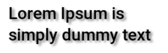
Shadow
Shadows can be added to all components except root.
| Property | Description |
|---|---|
shadow_color | String: hex or CMYK shadow color, no gradient |
shadow_blur | Number: blur in pixels on static / animated (≥ 0). See Units on Print Designs for printer. |
shadow_offset_x | Number: −200 to 200. Horizontal offset in pixels on static / animated. See Units on Print Designs for printer. |
shadow_offset_y | Number: −200 to 200. Vertical offset in pixels on static / animated. See Units on Print Designs for printer. |
Component notes:
- Text: if background color is enabled, shadow is applied to the background
- Button: shadows can only be configured on the background
Example
{
  "shadow_color": "#00000080",
  "shadow_blur": 3,
  "shadow_offset_x": 4,
  "shadow_offset_y": 3
}
Units on Print Designs
Lengths and sizes on static / animated designs are integer pixels (px). On printer / printer_multipage designs, the same properties are floats in the format's physical unit — mm or in — except font sizes, which are floats in points (pt).
Always read the property's own stated range for both cases — the ranges are not the same numbers. A printer design's float range is proportional to the static/animated integer range, converted through the format's DPI, rather than a literal reuse of it.
Why the unit differs at all
printer and printer_multipage designs render at a physical size and DPI rather than on a fixed pixel grid, so a pixel value has no fixed meaning until a resolution is chosen. Expressing lengths in the format's own unit, and font sizes in points, keeps them meaningful regardless of render DPI.
Related
- Generation — the endpoints these overrides are sent to
- Layers Overview — the same layer kinds in their two contexts
- Fonts — find font UUIDs for
text/buttonoverrides by name, category or weight - Colors & Gradients — the full token grammar