Button
See also
This is the generation-time override. To author a button layer's full schema at import time, see Design Import → Layer Types → Button.
The button is a container (with a background or a border) containing a text.
Available properties
A button accepts a subset of the text properties — skew_y, side borders and max_lines are text-only.
A button is the one layer with two alignments: alignment moves the button box, text_align moves the label's lines inside it — which only shows on a multi-line label, as a single line fills the box it is measured on. On a text layer there is only one, because there the alignment is the position.
| Property | Description |
|---|---|
payload | Same as Text Payload, capped at 2 048 characters (text allows 10 000) |
color | Same as Text Color |
background_color | Background fill color of the button container. Same format as color |
background_padding | Same as Text Background Padding |
font / font_weight | Same as Text Font — font is a UUID |
font_size | Number. Force font size — pixels on static / animated (must be ≥ 1), points (pt) on printer. See Units on Print Designs. |
min_font_size / auto_resize | Same as on text |
line_height | Number. Force line height in percentage (must be ≥ 1). Only applied on multiline text |
alignment | Placement of the button box — the nine-cell grid, same values as Text Alignment |
text_align | "left", "center" (default) or "right". Alignment of the label's lines inside the box — only visible on a multi-line label, since the box is sized on its longest line |
stroke_color / stroke_width | Border color and width of the button — see Stroke |
text_transform | Applied to the label. Same values as on a text element |
shadow_color / shadow_blur / shadow_offset_x / shadow_offset_y | Shadow of the button box. See Shadow |
text_shadow_color / text_shadow_blur / text_shadow_offset_x / text_shadow_offset_y | Shadow of the label. See Two shadows |
icon_url | Public HTTP(s) URL of an image to place beside the label. See The label icon |
icon_encoded | The same icon as base64, when you have the bytes rather than a URL — the twin of image_encoded. See The label icon |
icon_color | Recolours that icon. SVG only. Same format as color, no gradient |
The label icon
icon_url replaces the icon a button already carries, or adds one to a button designed without it. icon_color recolours it.
Or send the bytes instead of a URL, with icon_encoded — a bare base64 body or a data:image/<type>;base64, data URI, exactly as image_encoded works for an image layer. The same file types and the same size cap apply, and the value is never stored on the generation request. If you send both, icon_url wins.
Where the icon sits, how big it is and how far it stands from the label are set in the design, not per generation — the same way a text layer's font family is. Send icon_url to swap the image, icon_color to retint it; the geometry stays as the designer left it.
Recolouring only works on an SVG
icon_color rewrites the paint inside the file, and a raster has none to rewrite. A PNG or JPEG icon renders in its own colours whatever you pass.
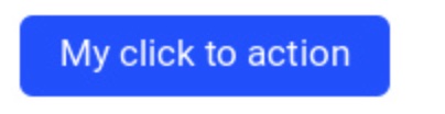
Example
{
  "payload": "My click to action",
  "color": "#FFFFFF",
  "background_color": "#1A47FF"
}
With an icon
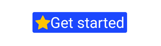
The icon is a second image on the button, next to the label. icon_url takes any public SVG (or raster) file, and icon_color repaints an SVG one so it matches the rest of the creative:
{
  "payload": "Get started",
  "color": "#FFFFFF",
  "background_color": "#1A47FF",
  "icon_url": "https://cdn.example.com/icons/star.svg",
  "icon_color": "#FFC400"
}
A button designed without an icon gets one this way: it lands on the left of the label, at the label's font size, with no gap. To place it elsewhere, resize it or space it out, set that in the design — see The label icon.
Gradient background, border and shadow
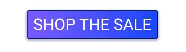
Everything below the label is overridable too: background_color and color both take a linear or radial gradient (on print, only background_color does), stroke_color + stroke_width draw the border, and the shadow_* family plus text_transform and background_padding finish it off.
{
  "payload": "Shop the sale",
  "color": "#FFFFFF",
  "background_color": "linear-gradient(0% 0% 100% 0%,0% #7A5CFF 1,100% #1A47FF 1)",
  "stroke_color": "#0B1F6B",
  "stroke_width": 3,
  "shadow_color": "#0B1F6B",
  "shadow_blur": 8,
  "shadow_offset_y": 4,
  "text_transform": "uppercase",
  "background_padding": 18
}
Two shadows
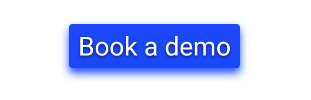
A button is the only layer with two shadows, and they are independent: shadow_* drops the box, text_shadow_* drops the label. Set one, the other, or both.
{
  "payload": "Book a demo",
  "color": "#FFFFFF",
  "background_color": "#1A47FF",
  "background_padding": 18,
  "shadow_color": "#1A47FF",
  "shadow_blur": 18,
  "shadow_offset_y": 10,
  "text_shadow_color": "#0B1F6B",
  "text_shadow_blur": 6,
  "text_shadow_offset_y": 3
}
Gradient label
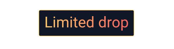
A gradient works just as well on color, over a flat background:
{
  "payload": "Limited drop",
  "color": "linear-gradient(0% 0% 100% 0%,0% #FFD166 1,100% #FF5D5D 1)",
  "background_color": "#101828",
  "stroke_color": "#FFD166",
  "stroke_width": 2,
  "background_padding": 18
}
Not everything is overridable
The corner radius cannot be overridden via API — set it in the design builder.
Related
- Text — the full property set this page subsets
- Common properties —
hiddenand shadows